Bryan Connor
Increasing Learner Success with the Nomadic Home Page

How removing ambiguity at re-entry lifted completion rates by 4% and a key engagement metric by 21%
Great Learning Experience, Poor Entry Point
Nomadic is a cohort-based learning platform used by global organizations to develop leadership skills through multi-week programs that blend video content, reflection exercises, applied practice, and peer discussion.
Inside the Programs, the learning experience had evolved over time to hone in on:
Clear learning objectives and scaffolded content
Momentum-building pacing (live progress bars, short modules, quick wins, varied formats)
Gamification elements (upvotes, leaderboards, badges)
Rich social engagement (discussion prompts, peer comments, replies and reactions, visible cohort activity)
Across all of our customers there was a 74% average completion rate for programs, which was great, industry-leading even. But this was our customer’s most important measure of success, and internal analytics hinted that there was more room to grow.
The Research
When we took a look the data showed:
30% of first logins exit without getting into in a program
Also saw extremely long learning sessions - an average of 55 minutes for some customers
4-5 day gaps between learning sessions
More than half of completions bunched at deadline
I then conducted focus groups with a few different types of users including superusers, those very motivated by headlines, and those who hadn’t completed a Program and asked:
"Walk me through what happens when you log in to Nomadic."
"How do you decide what to do next?"
"Tell me about a time you were unsure what to do."
What I heard:
"I forgot what this was about,"
"Don’t know if I have enough time to finish this by the deadline "
"felt overwhelmed”
“I spent a lot of time in here, I thought I finished this already”
The key takeaway:
From our data on the length of learning sessions we could see that people weren’t struggling to stay engaged with the learning experience, they were struggling with the decisions to engage. The homepage was where a lot of people got stuck, likely because the prospect of finishing a Program felt like a monolithic commitment. We had infused behavior psychology into every aspect of the learning experience but took the entry point for granted.
Design Principles
These insights led to four guiding principles for the homepage redesign:
Immediate clarity → Answer "What should I do next?" instantly, without requiring thought or exploration
Use what's already working → Bring the social proof, momentum cues, and gamification from inside programs to the entry point
Adaptive states → Support learners differently at first entry (starting) vs. re-entry (continuing)
Lower the commitment threshold → Make the next step feel small and achievable, not monolithic
The goal wasn't to rebuild the learning experience. The goal was to build a better bridge to it.
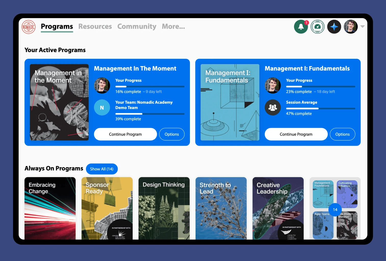
The Solution: A Dynamic Program Card That Bridges to the Experience Inside
We redesigned the homepage around a single, powerful component: The Dynamic Program Card. The Program card began an adaptive interface that surfaces the momentum-building features from inside programs and applies them to the critical entry moments.
This wasn't about adding new features. It was about strategically exposing what we'd already built at the moments when learners needed them most: when deciding to start or continue.
The card adapted to four key states:
State 1: Pre-Start (Reducing First-Entry Friction)
What learners saw:
Personalized invitation: "You've been invited to join [Program Name]"
Short description of what the Program is about
Small avatars of 3–5 teammates who already began: "5 teammates are already learning"
What this surfaced from inside the program:
The social proof that was already happening (peer enrollment, progress)
The clear learning objective for the Program
The fact that the Program was assigned directly to you
Behavioral purpose: Use social proof and clear context that the Program is assigned to encourage learners to take the leap and get started.
State 2: Active Progression (Solving the Re-Entry Problem)
Once a learner began, the card dynamically rotated through cues that had already been proven effective inside programs:
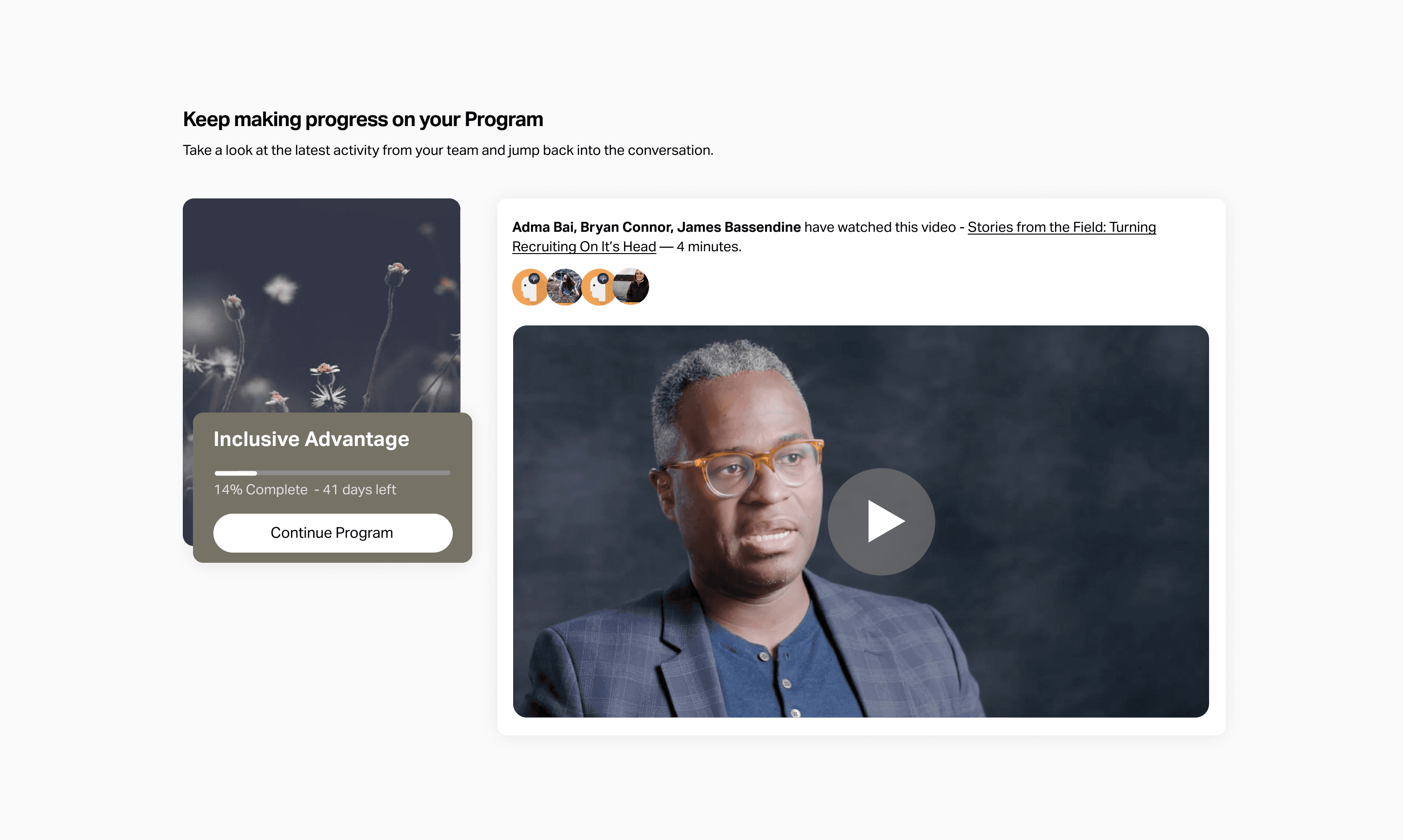
A. Upcoming module preview (surfacing instructional design)
Clear next step: "Keep making progress on your Program"
Social Proof: Peers have already completed this module.
The type and title of the module itself "Stories from the Field: Turning Recruiting On It's Head"
Estimated time: "4 minutes"
What this surfaced: The same scaffolded, bite-sized structure that made in-program momentum work—now visible without clicking in.
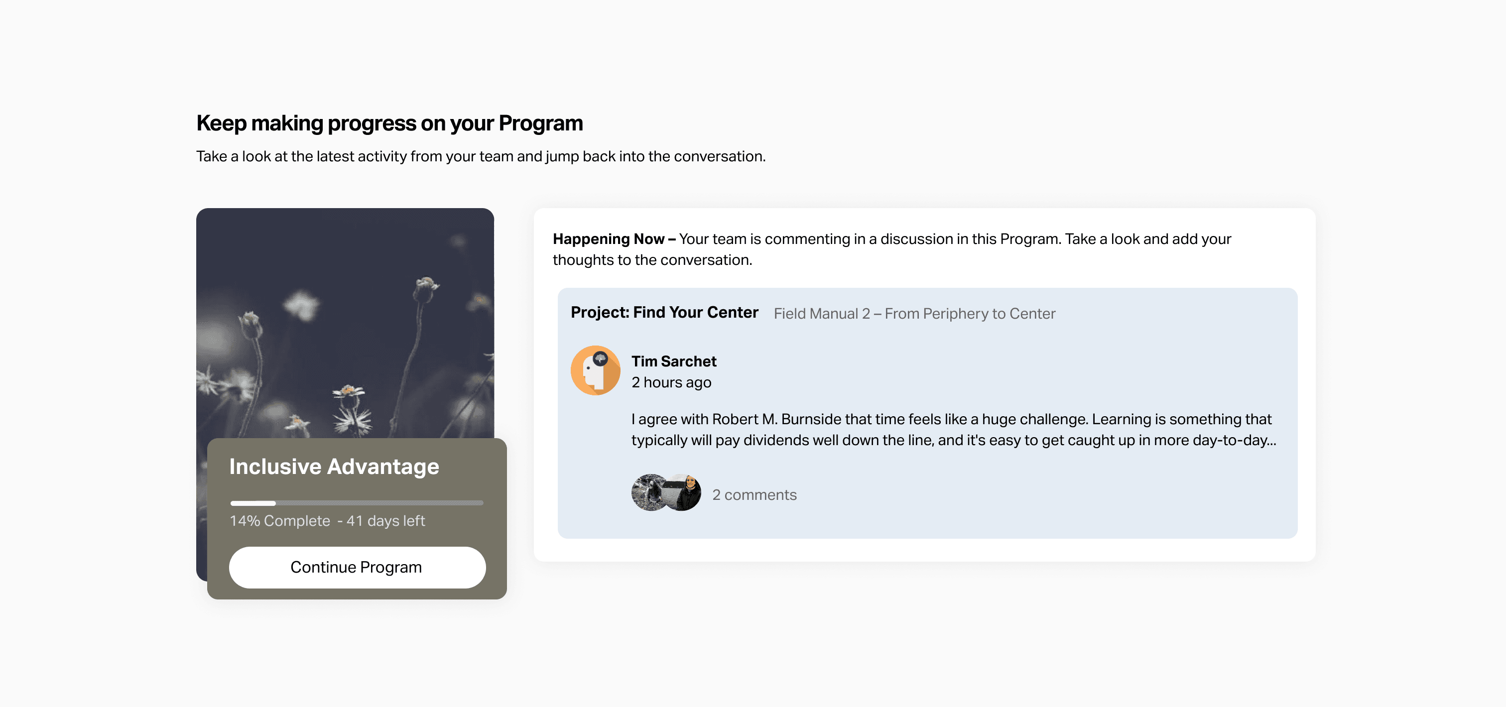
B. Recent peer comments (surfacing social engagement)
Either a single comment or 2–3 recent comments from teammates on modules the learner just completed or is about to start.
What this surfaced: The rich peer discussion happening inside—now serving as both social proof and a curiosity hook.
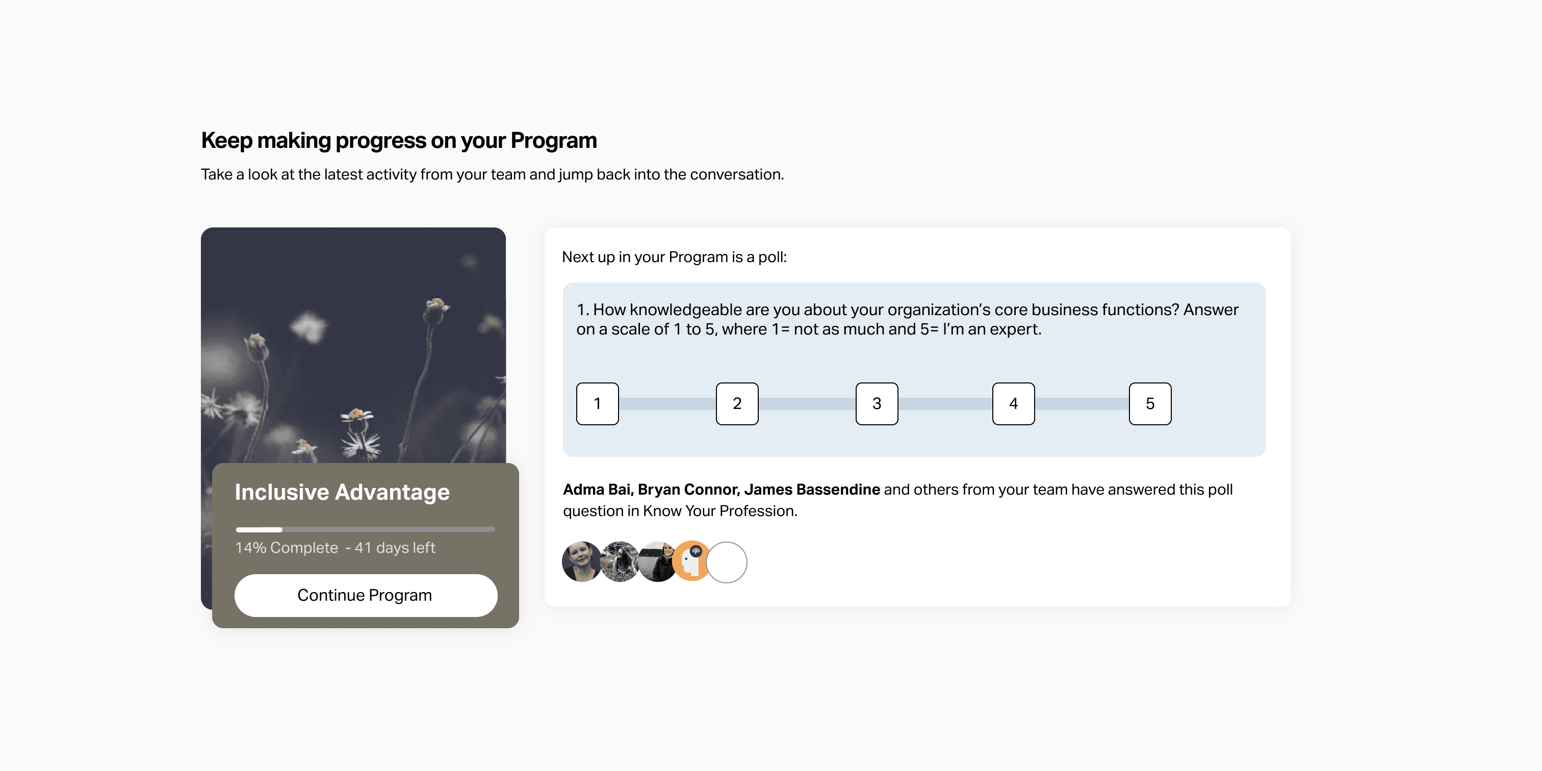
C. An upcoming interactive module
Preview of the poll question
Invitation to see results from your peers after you make your selection
What this surfaced: A piece of content the learner could complete in one click and another curiosity hook for viewing your peer's opinions.
State 3: Deadline Approaching (Surfacing Temporal Cues)
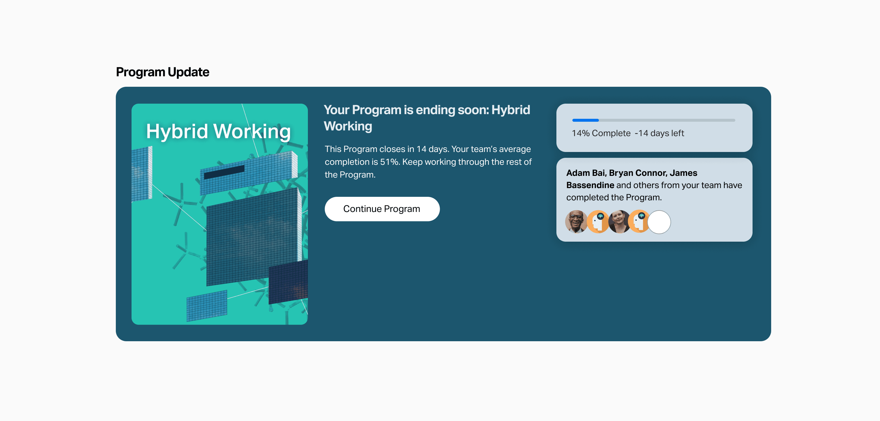
As the program neared its end date:
The card gets visual emphasis and states "Your Program is ending soon"
It highlights peers that have already completed
Behavioral purpose: Gentle urgency and focus that our social learning psychology to help learners prioritize.
The states all worked together to move learners towards the same outcome: making small commitments towards progress and completion.
Build Process
The redesign required collaboration across commercial and product teams, especially for relationship management and rollout to our pilot customer. I pushed the project forward from start to finish and was responsible for:
Research & Synthesis: Identifying the homepage as the critical bottleneck through quantitative data (product analytics) and qualitative research (Customer Advisory Board listening, post-Program survey analysis)
UX strategy: Defining the logic for dynamic homepage behavior across learner states, and determining which in-program elements (social proof, gamification, instructional clarity) to surface in each state
Component design: Creating the UI system and all state variants in Figma, ensuring visual consistency with the in-Program experience
UX and Copy Testing: Using Ballpark to get directional clarity for UX options and to A/B test copy used in the component’s states.
Engineering collaboration: Working closely with engineering to adapt to edge-cases, align to designs, test iterations, manage rollout and collect new usage data.
Pilot Results
We piloted the redesign with one of our closest customers, who had a 67% average completion rate across all their previous programs.
For their Program with the new homepage:
Average completion rate rose from 67% to 71% (4% lift)
Non-required comments per learner: 1.9 → 2.3 per learner (21% increase)
More consistent pacing: Reduction in "last-minute" completions bunched at the deadline
Increased return-to-lesson engagement after login
The increase in non-required comments was a surprise impact—it suggested the homepage created a positive feedback loop, lifting both completion rates and engagement depth.
Through post-Program surveys, we heard from learners:
"I like seeing what my co-workers are saying"
"It reminds me what I was learning about"
"Alive and approachable"
“It’s easy to get sucked in”
The success of the pilot with both learners and the customer gave us confidence to start the process of rollout to more customers and to turn the feature on by default for new customers.
Key Learnings
This project expanded how I think about learner psychology and success:
1. The Entry Point Is as Important as the Core
We'd invested heavily in instructional design, gamification, and social features inside programs but neglected the homepage. The result: a beautifully designed experience that learners struggled to access. The entry point isn't second-fiddle to the main experience; it's the foundation of whether people engage at all.
2. Don't Build New—Surface What's Working
The solution wasn't adding features. It was strategically exposing the momentum-building elements we'd already built (social proof, progress tracking, clear next steps) at the moments when learners most needed them. This principle applies broadly: before building new, ask "What's already working that we're hiding?"
3. Friction at Entry ≠ Friction Inside
Learners who made it inside programs had strong completion rates. The problem wasn't content quality or instructional design—it was the ambiguous, effortful experience of deciding to start or continue. Entry friction and in-experience friction are separate problems requiring different solutions.
4. Momentum is Emotional Before It's Cognitive
The homepage redesign reduced cognitive load , but more importantly, it addressed emotional barriers: fear of starting, loss of context, feeling behind. Behavioral design elements (social proof, tiny visible wins, temporal cues) have big effects in pre-decision moments.
5. Dynamic Interfaces Make Beginners Feel Supported
A static homepage treats all learners the same. A dynamic one adapts to journey stage—meeting beginners with encouragement, returning learners with context, and finishing learners with celebration. This adaptiveness creates a sense of being "seen" that increases trust and engagement.
Future Iterations
Beyond lifting completion rates, the redesign gave us a canvas to make further improvements. Some things that we added to our list of experimentation ideas during and after launch included:
Leaderboard snapshots
Prompt learners to commit to making progress x days in a row
AI-generated discussion summaries or module recaps
Listing unfinished activities in a module
In-depth A/B testing of more UX copy
Personalized encouraging copy
Pairing more component states with notification emails
This project taught me that the quality of the learning experience doesn't matter if learners hesitate to access it. Entry and re-entry points are where momentum is won or lost.
The solution wasn't to rebuild what was working. It was to build a better way in.
Thanks for reading!